Tuesday, August 21, 2012
Curving Text in Embird using Embroidery Alphabets
I get the question almost daily, "How do you create the name curved around an applique shape?" Curving text around objects is really easy using Embird. In this post I'll show you how I do it with an embroidery font on my computer. I will be doing a separate post on curving text using Embird Font Engine.
This may not be the ONLY way to do it, it is just the way that I've used over the years to get my text curved around my desired shape. Also, Embird is not the only software that will do this, it just happens to be the one that I use. BTW, I am not endorsing or associated with Embird in any way :)
CURVING TEXT USING EMBROIDERY FONTS ON YOUR COMPUTER
Start in Embird Editor screen and open the applique design that you would like to add text to.
Next, you will merge the text letters. Click the "Merge" icon or click "File" "Merge" which brings up the Merge Files dialog box. Navigate to the folder which contains the alphabet that you are bringing in. Click on the first letter of the text you want to bring in. Now, holding down the Ctrl key, click each letter that you want to add until you have all the desired letters highlighted. It should look like the pic below.
Click OK. Now your letters are placed into your design, all 'dumped' into the center of the design on top of each other. Now you will separate and align them onto a straight line by clicking and dragging each one separately into a straight line. You can do this anywhere on the screen for now as we will move the text later when we get it curved. (The alphabet shown is Applique Market "Madeline" font.) Now your design should look something like this:
Now, group just these letters by selecting them in the boxes on the far right of your screen. Click the first letter, then while holding down the shift key, click the last letter, and they should all be selected and you should see a box around the entire word.
Now right-click on the word box. This will bring up a long pop-up menu. Scroll down to Set (about 1/3 of the way down). While you are hovered over "Set", another pop up appears. Scroll over and click "Set Envelope". This will bring your letters into a new screen. If you are not already, click the "Layout" tab at the top left of the screen. Your screen should look like this:
This is where you will set the shape for your text to curve around. At the bottom left you will see "Baseline", the default is "Line". Next to "Line" is a small down arrow. If you click here you will see the Baseline options, Circle, Wave, etc. These different baselines can be used for different angles. For the football in this example we will click "Circle".
Now your text is curved around a circle like this:
Now you will tweak the circle to be more of the shape of a football. Under the baseline you'll see "Width", "Height" and a "Keep Ratio" box. Uncheck the "Keep Ratio" box and decrease the "Height" number until your circle is more of an oval. Now using the tiny squares under each letter, you can move each letter closer together or further apart to get the look you want. Use the first square on the line to move the whole word together around the oval shape.
In this area you can use the other boxes to raise a letter up or down or tilt it, etc. There are tons of ways here to tweak your word, also by changing the 'Envelope' setting, this is something you should play around with a you'll find lots of ways to manipulate your words! Also, we won't need it for this example, but you can move the text to the inside of the circle or oval by checking the box "Place on the other side". That's a helpful tool at times also.
For this example, I moved the word around to the right of the oval and moved each letter a little closer together for a better look since this is a script I wanted them touching. After you tweak your letters they should look something like this:
Now click OK. Your word is brought back into your design, 'dumped' into the center of the design. Now be careful here as your letters are still separate, but are grouped together into a box. If you click on the box you can move them around as a whole, if you at any point click outside the box, they will be ungrouped and you'll have to group them again.
Now this part is where you'll have to make a few tweaks if necessary depending on several factors...your design size, text size, text angle, etc. This is what my example looks like at this point:
I'm going to click on the box around the word and move it over to the football. After I get it over to the football, I'm going to click the "Rotate Mode" icon (left side toward the top) and rotate the entire word box to a better angle on my football. After you finish rotating be sure to reclick the "Select Mode" icon (left top) so that you are off of Rotate Mode. All of this must be done while the letters are still selected in a box. After these two tweaks it looks like this:
Alright I think we have something here! Now I am happy with my curved word. So, I am going to join my word together by pressing Ctrl + I (shortcut for join). Now I can add more designs or words or just save my file and begin stitching.
If at this point you are NOT happy with your word, you can rotate each letter individually if necessary or you can go back to Set Envelope and play around with the settings in there. Once you do this a few times you'll get comfortable with the sizes and angles and you'll find it's quick and easy. Much quicker than explaining in this post!
I hope you'll give this a try to add some different looks to your appliques!
Applique Everyday!
Karen
Monday, July 23, 2012
My Studio Redo
After years of waiting we recently ripped up the carpet in our bedroom and my studio and put down wood flooring to match the rest of the house. That meant everything had to come out of the studio which was quite a task! In the process I decided I would PURGE and only keep what I really needed and was planning to use. Once those new wood floors went in I decided that an overhaul of the room was long overdue, after all I spend many, many hours in here either working at the computer or designing and stitching appliques.
So, first I will share my BEFORE photo with you and it is, well, a little scary! I did a decent job of keeping it clean and things put away, but it was very cluttered. I had lots of shelves and storage, but none of it was pretty! I was using our old kitchen table for a desk which meant no drawers or keyboard tray. And all my tables were white plastic 'church' tables. And lots and lots of plastic storage bins!!
Okay are you ready? Here's before...
Not awful, but nothing exciting. I hope this is not the pic that ends up on Pinterest!
Now, on to the good stuff! Here is my after...
Quite a change I know! My studio is actually our 4th bedroom and was once our laundry room before our house was remodeled several years ago. It is not a regular size bedroom, much smaller actually, just 9 feet wide by 11 feet long, with a closet.
The bins hold supplies for the sewing machine and a few other things. The rods, bins and hooks for the bins are all from Ikea. The rod clips that are holding the samples are curtain clips, these are from Wal Mart. They matched the Ikea things perfectly.
This little chest is a local antique mall find. It is great for storage! I lined the drawers with dollar store wrapping paper.
Now for my favorite part of the room...
Believe it or not this dresser was a freebie given to me by a friend who wanted to get it out of her garage! Now it did not look like this when I got it...Here is the before:
The bottom two drawers were missing :( My friend gave me the idea to use baskets in place of the drawers. She did have one of the drawer fronts which had two handles on it so I had my husband cut two strips out where the handles were and we mounted them in the middle for a separation for the baskets. Then I painted it all white and distressed and waxed it (Annie Sloan chalk paint). The challenge was finding just the right baskets and I tried many before I decided on these which came from Michael's.
The two shelves are from www.target.com. They arrived in boxes and my husband put them together. Finding the right baskets for these was challenging also. These I finally found at Homegoods and the two bottom on each shelf hold the fabric that I use most, separated into 'big dots', 'little dots', 'checks' and 'other'. The rest of my fabric is stored in the closet in the room.
The vintage chandelier was a $20 find from a local antique mall. It had been half spray-painted white and had no crystals, but luckily I had a stash of crystals from my days as an antique dealer (before I was a digitizer). I covered all the light sockets with little plastic bags and hung it from a tree in my backyard and spray painted it with flat white spray paint (the cheap kind from Wal Mart!). I purchased a swag light kit ($18 from Home Depot) and it had the chain, wire and hooks all included. I made the cord cover from cotton fabric. Since I have a large flourescent light in the room I really didn't need any extra lighting so I put 15 watt bulbs in just for 'atmosphere' and they are perfect! This was something I had always wanted to do in a room in my house so why not my studio?!
I made the valance from regular burlap (from Joann) and lined it with tan cotton. Made the ruffle by zig
zagging over jute string and then pulling it to ruffle and fraying the ends a bit. Took me all of about an hour!
I found this white desk at a local salvage furniture store that has brand name furniture that is 'less than perfect'. I thought it was just right for the room. It's so nice to finally have a keyboard drawer and a few drawers for supplies. Over top we added a couple of floating shelves (Home Depot) and that gave the desk some height and a place to display photos and have a little storage.
And finally, my closet got a bit of a redo also, this is where I keep the rest of my fabric and the few blanks that I still keep in stock. I could have done more here but by the time I got to the closet I was getting burned out!
Here's a close up of some of my favorite details of the room.
I used a vintage glass carrier filled with dollar votive holders to hold the things I use often on my work table.
These wire baskets look vintage but are new from Big Lots...
And I love having this pic of me and the other digitizers from the Everything Applique Conference.
Thanks to my hubby for all the work he did to help me with the room...even when he thought I was crazy for hanging a chandelier over my work table he went along with it :)
I hope that my studio will inspire you to make your sewing space something that you love to work in and a place where you can be your most creative!
So, first I will share my BEFORE photo with you and it is, well, a little scary! I did a decent job of keeping it clean and things put away, but it was very cluttered. I had lots of shelves and storage, but none of it was pretty! I was using our old kitchen table for a desk which meant no drawers or keyboard tray. And all my tables were white plastic 'church' tables. And lots and lots of plastic storage bins!!
Okay are you ready? Here's before...
Not awful, but nothing exciting. I hope this is not the pic that ends up on Pinterest!
Now, on to the good stuff! Here is my after...
Quite a change I know! My studio is actually our 4th bedroom and was once our laundry room before our house was remodeled several years ago. It is not a regular size bedroom, much smaller actually, just 9 feet wide by 11 feet long, with a closet.
When I decided to revamp I had 3 goals:
1...no more white plastic tables or plastic storage bins!
2...a vintage dresser for a work table and
3...a display wall for my samples that I could change.
THE SAMPLE/SEWING WALL
I had spotted this system on a trip to Ikea and thought it would be perfect.
The bins hold supplies for the sewing machine and a few other things. The rods, bins and hooks for the bins are all from Ikea. The rod clips that are holding the samples are curtain clips, these are from Wal Mart. They matched the Ikea things perfectly.
This little chest is a local antique mall find. It is great for storage! I lined the drawers with dollar store wrapping paper.
Now for my favorite part of the room...
THE WORK TABLE WALL
Believe it or not this dresser was a freebie given to me by a friend who wanted to get it out of her garage! Now it did not look like this when I got it...Here is the before:
The bottom two drawers were missing :( My friend gave me the idea to use baskets in place of the drawers. She did have one of the drawer fronts which had two handles on it so I had my husband cut two strips out where the handles were and we mounted them in the middle for a separation for the baskets. Then I painted it all white and distressed and waxed it (Annie Sloan chalk paint). The challenge was finding just the right baskets and I tried many before I decided on these which came from Michael's.
The two shelves are from www.target.com. They arrived in boxes and my husband put them together. Finding the right baskets for these was challenging also. These I finally found at Homegoods and the two bottom on each shelf hold the fabric that I use most, separated into 'big dots', 'little dots', 'checks' and 'other'. The rest of my fabric is stored in the closet in the room.
Don't you just love these chalkboard tags? I got these from BradensGrace on Etsy. I used a chalk marker from Hobby Lobby to write on them, it writes darker than actual chalk and still comes off with water. I have to get some more of them!
The vintage chandelier was a $20 find from a local antique mall. It had been half spray-painted white and had no crystals, but luckily I had a stash of crystals from my days as an antique dealer (before I was a digitizer). I covered all the light sockets with little plastic bags and hung it from a tree in my backyard and spray painted it with flat white spray paint (the cheap kind from Wal Mart!). I purchased a swag light kit ($18 from Home Depot) and it had the chain, wire and hooks all included. I made the cord cover from cotton fabric. Since I have a large flourescent light in the room I really didn't need any extra lighting so I put 15 watt bulbs in just for 'atmosphere' and they are perfect! This was something I had always wanted to do in a room in my house so why not my studio?!
I made the valance from regular burlap (from Joann) and lined it with tan cotton. Made the ruffle by zig
zagging over jute string and then pulling it to ruffle and fraying the ends a bit. Took me all of about an hour!
THE DESK WALL
The vintage white frame is another find that I've had stashed in my shed a while. Again, lots of flat white spray paint and a little distressing. The thread holders are from Joann and were also spray painted white. Now, this is not all the thread that I have, but it's the colors I use most. I have the rest of my thread stored in a bin close by when I need it.I found this white desk at a local salvage furniture store that has brand name furniture that is 'less than perfect'. I thought it was just right for the room. It's so nice to finally have a keyboard drawer and a few drawers for supplies. Over top we added a couple of floating shelves (Home Depot) and that gave the desk some height and a place to display photos and have a little storage.
And finally, my closet got a bit of a redo also, this is where I keep the rest of my fabric and the few blanks that I still keep in stock. I could have done more here but by the time I got to the closet I was getting burned out!
Here's a close up of some of my favorite details of the room.
I used a vintage glass carrier filled with dollar votive holders to hold the things I use often on my work table.
These wire baskets look vintage but are new from Big Lots...
The burlap curtain as a backdrop for the dainty vintage chandelier...
This thread catcher is from nstitches4u on Etsy. I love it! It holds pins and has a bag for threads and a pocket for your scissors.
And I love having this pic of me and the other digitizers from the Everything Applique Conference.
Thanks to my hubby for all the work he did to help me with the room...even when he thought I was crazy for hanging a chandelier over my work table he went along with it :)
I hope that my studio will inspire you to make your sewing space something that you love to work in and a place where you can be your most creative!
Friday, December 23, 2011
Merry Christmas 2011
Merry Christmas from the Applique Market crew! I hope you have a blessed Christmas! I have been so blessed this year and have been able to take a little break this last couple of weeks and enjoy the season with my family. Today I am going to start baking and decorating my sugar cookies that my family looks forward to every year.
Blessings to your family,
Karen
Thursday, February 10, 2011
Using Embird to Create a Circle Monogram

I've had so many questions on how to use software to create a monogram with my Circle Monogram Font. I will attempt to walk you through doing this with Embird, and you may find it helpful even if you use a different software for combining your designs. Please don't let the length of this scare you...it is super simple and really just a few steps.
First of all, some thoughts about Embird. I love Embird and couldn't live without it! Having said that, it is the only embroidery software I have used, so there may be others that are just as good but I just haven't tried them. Also one nice thing about Embird is you can add elements after, like keyboard fonts, Font Engine, Digitizing and more. The keyboard fonts are as low as $12 each (depending on what site you purchase from) but the great thing about them is you don't have to bring in one letter at a time, you can type your name or phrase or whatever, and it generates all the letters at once, and you can squeeze and manipulate the letters without distorting the stitches. By the way I am not associated with the makers of Embird in any way and do not earn a commission!
So back to the Circle Alpha. First of all open the Embird software and you want to be in Editor. It will look like this.
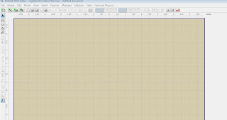
Click the Merge shortcut icon on the top, or click File Merge.
A window will appear so that you can choose your file to merge. Find the folder on your hard drive with the Circle Alpha, and open the folder of the size that you wish to use. Each folder of the Circle Alpha contains Satin and Zig Zag, then then subfolders for all formats, then all letters of the alphabet in Left, Center and Right. First we will bring in the Left letter in the monogram. So go to your format subfolder, then select your desired left letter and double click on it. (Letters are named with either l, m or r in front of the letter).
Now your Embird screen will look like this:
The letter will default to the center, but just leave it there for now and we'll move it later.
Now repeat the same steps to add in the middle and right letters of the monogram. Click File, Merge, and select the middle letter, and repeat for the right letter. If you are feeling confident in your Embird skills you can combine all three in one step. Just click on the first letter, hold down the CTRL key and click on the second letter, then while still holding the CTRL key select the third letter and double click on that third letter and poof! Now you've added all three in one step. Quite a timesaver! Now with all three letters your screen should look something like this, depending on which letters you merged:
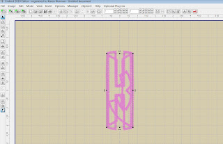
Now you are getting there! All that is left is to arrange the letters in a circle and make sure your design is centered. Start by clicking on the top letter, hold your mouse on it and drag it out of the way. Now do the same for the next two - drag them off the center also, making all three of them separated from each other. Now, click on your middle letter and you will see a 'box' around it. Next you will center that letter by having Embird center it for you. On the left side of the screen there are several icons that go horizontally down the page. Find the icon (you can 'hoover' over them and see the description) called "Center" and click on it. There, now your middle letter is centered.
Now click, hold and drag one of the side letters and 'eyeball' it to where it needs to be. I like to, after I've eyeballed it, click on the icon "Center Vertically" and Embird will do that for you. Then do the same for the last letter, so that your monogram is now a circle. One more thing I like to do to make sure it's all centered is hold CTRL and press "A" (this will select all) then click the "Center" icon again, this will center your entire design:
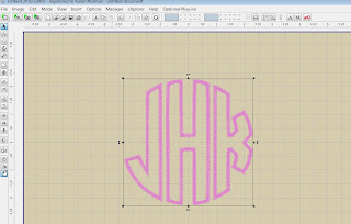
Now, at this point you could save the design and stitch it out. But here is one more step that I like to do to make it easier for me on the stitchout on something like this. Most likely you will be doing all three of these letters in one fabric, as one design. If you are not doing that and you want your monogram in three different fabrics, DON'T do this step.
Notice that before you do this step, on the upper right of your screen Embird shows your letters as 3 separate boxes.
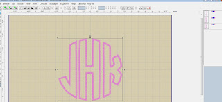
We are going to tell Embird to combine them into 1 design with 1 outline, 1 tackdown and 1 satin step. Press and hold CTRL and press "A" to select all. Now RIGHT click on the now-joined letters and you will see a pop up list of many different options you can do to these designs. Go down and select "Smart Color Sort". If a pop-up comes up asking you about Tolerance, just click OK. Now, look again at the upper right and you will see that Embird now shows this as one design with 3 steps, 1 placement, 1 tackdown and 1 satin. As below:
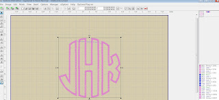
Now just save your file and transfer to your machine the way you normally would. You're done!
Saturday, July 3, 2010
New Flip Flop Designs
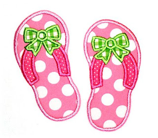
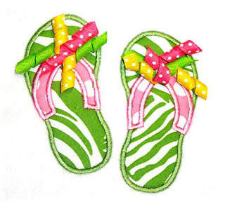
I've added two new designs this week, flip flops and flip flops with bows. These appliques are great for beach cover-ups, beach bags, towels, tshirts and more! You can also add your own ribbon bow for an adorable look! You can get these at www.appliquemarket.com and for a limited time we're having 30% off all designs!
Friday, June 18, 2010
Free Design!
Monday, June 14, 2010
Applique Tutorial
Applique only looks difficult! Follow these steps to perfection every time:
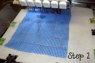
Step 2. Using sticky spray such as Sulky KK 2000, spray the wrong side of a piece of fabric that is slightly larger than the outline size. Lay the fabric on top of the outline and gently press with your hand to remove any air pockets. Start your machine again to stitch out the tack down stitch. On my designs this will be a 'double run'.
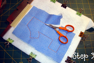
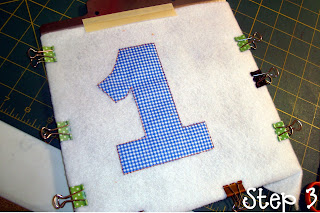
Step 3. Remove the hoop from your machine and using small curved scissors (don't even try this with regular scissors!!), cut around the shape, cutting right up against the stitching, pulling the fabric slightly where necessary to get a close cut. When you're done with this step, you should have your applique shape cut out entirely.
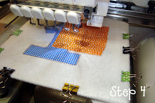
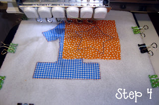
Step 4: Now put the design back in the machine and stitch out the next outline stitch for the next part of the applique. Using sticky spray such as Sulky KK 2000, spray the wrong side of a piece of fabric that is slightly larger than the outline size. Lay the fabric on top of the outline and gently press with your hand to remove any air pockets. Start your machine again to stitch out the tack down stitch. On my designs this will be a 'double run'.
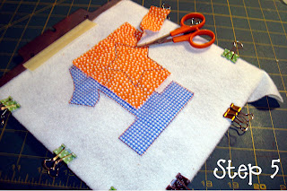
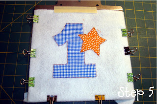
Step 5: Remove the hoop from your machine and using small curved scissors once again cut around the shape, cutting right up against the stitching, pulling the fabric slightly where necessary to get a close cut.
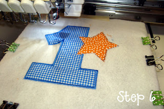
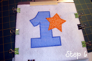
Step 6: You're almost done! Now just let the machine stitch out the finishing satin stitches to complete the design.
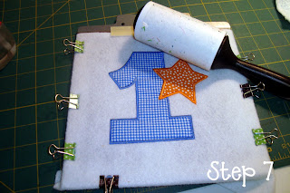
Step 7: Finally, you can use a lint roller to clean up any loose threads or fabric pieces. Now, enjoy your applique!

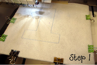
Step 1. Load your design into the machine and stitch out the first color which is the outline of the first shape.

Step 2. Using sticky spray such as Sulky KK 2000, spray the wrong side of a piece of fabric that is slightly larger than the outline size. Lay the fabric on top of the outline and gently press with your hand to remove any air pockets. Start your machine again to stitch out the tack down stitch. On my designs this will be a 'double run'.


Step 3. Remove the hoop from your machine and using small curved scissors (don't even try this with regular scissors!!), cut around the shape, cutting right up against the stitching, pulling the fabric slightly where necessary to get a close cut. When you're done with this step, you should have your applique shape cut out entirely.


Step 4: Now put the design back in the machine and stitch out the next outline stitch for the next part of the applique. Using sticky spray such as Sulky KK 2000, spray the wrong side of a piece of fabric that is slightly larger than the outline size. Lay the fabric on top of the outline and gently press with your hand to remove any air pockets. Start your machine again to stitch out the tack down stitch. On my designs this will be a 'double run'.


Step 5: Remove the hoop from your machine and using small curved scissors once again cut around the shape, cutting right up against the stitching, pulling the fabric slightly where necessary to get a close cut.


Step 6: You're almost done! Now just let the machine stitch out the finishing satin stitches to complete the design.

Step 7: Finally, you can use a lint roller to clean up any loose threads or fabric pieces. Now, enjoy your applique!
Subscribe to:
Posts (Atom)


